
If you think that various colors on the "Map of The Soul: 7" album covers were selected just to look good, think twice. The couple duo who crafted and produced the albums, Sparks Edition, disclosed that every one of the four designs and styles has a particular significance to BTS and their journey throughout their career.
Recently, Sparks Edition unveiled why the "7" logo itself has been put together. By incorporating seven specific fonts, all were selected by a different member of the BTS to reflect its personality and individuality.
The markings portrayed the mutual experience and journey of the band, as seven members over seven years when merged. The design duo has now confirmed that every edition of the "Map of The Soul: 7" does have its own particular meaning.
Sparks Edition consumed and processed hours on hours on content materials from the band, including fan-made compilation albums of all BTS participants, to create the "Map of The Soul: 7" as true to BTS as possible.
"We actually researched them like a nerd because we needed to produce a narrative for every member," Jang Joon Oh said.
It was not easy to combine the seven "7" signs from each individual into one design because aesthetics and idea had to be balanced. Yet, the creators found a way to deal with four spectacular and exclusive coverings throughout several months.
Initially, the distinction can sometimes seem random and unimportant for each cover edition. Still, Sparks Edition genuinely overlaid and painted the "7" marks in various ways to reflect different sides of the boy band BTS.
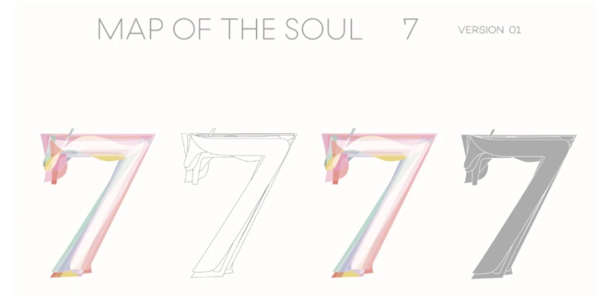
Version 1 was based on swans and included a pastel color theme. While its shades are very distinct from those shown in the music video called "Black Swan," it reflects similar elements: aspiring for vulnerabilit, perfection, and purity.
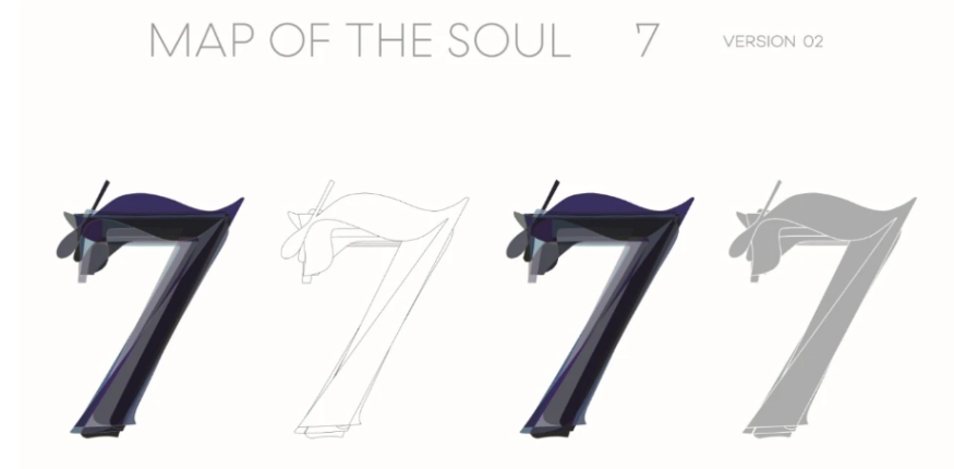
Version 2's inspiration was black swans - the titular black swans, which defines this era. The seven "7" markings were made differently on this covering to establish a curvy form. Mixed with the dark blue and monochromatic color shade, this reflects the stylish shadows of BTS.
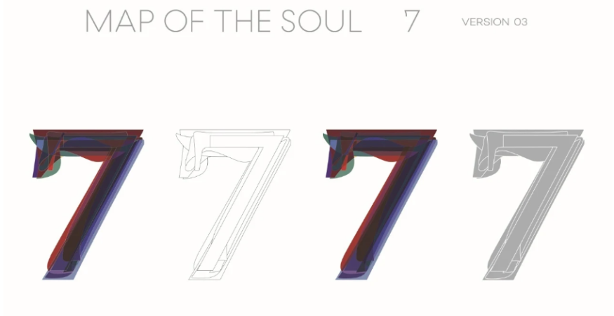
The "7" labels have been designed in Version 3 to produce a rather straight, rigid form. Sparks Edition has done so to reflect the power and a sense of responsibility. That can also represent the bold red, blue, and blackish color shade (also the colors of the South Korean flag).
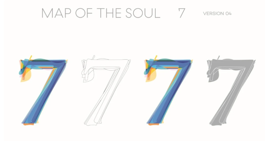
Lastly, the various labels for optimal harmony were placed in Version 4. This was through the intention to reflect the unity, ego, and identity of BTS members as a whole.
The creators of the Sparks Edition claimed that the album covers are among their favorites to design, craft, and produce.
There is no question, considering all the thoughts and procedures behind the whole project, that developing the "Map of The Soul: 7" would be a marvelous and unforgettable experience for them.
"It's the easiest concept we've been working on in a manner, but also has the biggest narratives in it," A Ji Hye shared.